Posts Tagged 'What If'

WHAT IF PENGE 5: TWANGS V2

This is another design for Twangs.

We love Twangs. It’s a great local business, friendly and helpful.

It’s on a corner site in a prominent position as you enter the main high street.

Currently it looks like this.

But what If:

This is what it looks like with an awning out with a closer view of the directory for Maple Road businesses which would be aluminium formed trays with vinyl type so that they can be updated.

This is a close up of the sign, signwritten of course!

Close up of the Maple Road directory. It makes sense to group it with the sign and make it a little lower so it’s more visible and links with the road signage so it works with it as a unit.

Finally, another view of the side with the blinds retracted.

Many thanks to Peter O’Connor signs and Smudge Studio who helped with both designs for Twangs Guitars.

WHAT IF PENGE 4: TWANGS V1

We like Twangs. It’s a great local business, friendly and helpful.

It’s on a corner site in a prominent position as you enter the main high street.

Currently it looks like this.

But what if:

A little closer

Yes, all the knobs go up to 11:

Many thanks to Peter O’Connor Signs and Smudge design who we worked with on this.

www.twangguitars.com can be found here.

The second route for this wil be uploaded in a day or two.

WHAT IF PENGE 3: GREEN BOOTS

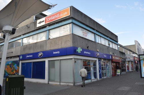
We have never been fans of brutalist style concrete buildings. Our school was like this. They don’t look good when they get dirty…

Like this.

But what if:


The advantage of green walls is that they reduce noise, keep the building cool in summer and warmer in winter, encourage butterflies and are maintenance free (they are self irrigating). We think they are rather beautiful.


WHAT IF PENGE 2: MUNCH & CRUNCH BAKERY V2

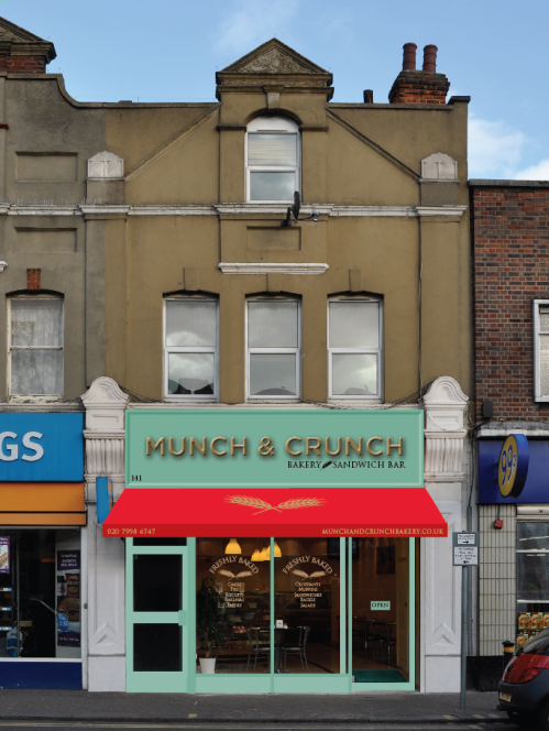
This is another version of Munch & Crunch Bakery.

The sign is wooden formed letters on a wooden background with graphics in the window and new red awning.We had a look at it in another colour (it’s a farrow and ball-esq green, so if it appears brighter it’s your screen, some computers don’t cope with the colour that well unfortunately!)

WHAT IF PENGE 1: MUNCH & CRUNCH BAKERY

The current Munch & Crunch is a great little business in the heart of Penge. They make fantastic cakes. They are so much better than they currently portray themselves. We have never been fans of back lit illuminated boxes and putting images of food on them. When a business is small and makes quality products by hand we feel the signage should reflect that. So what if:
The sign is handcrafted by a traditional signwriter, new awning, window graphics and repainted shop front. It’s the same business, same prices, the only think that has changed is the signage, awning and graphics. The all important number is displayed on the sign. We prefer the version above, but it could go into richer, coffee-esque colours: Here is a close up of the window: Or it could use